
Key metrics introduction (User acquisition, Page Views & Unique Page Views, Demographic details)
Google Analytics 4 (GA4) provides useful data that helps explain how a website is performing and how users interact with content. For this web analysis, I focused on three important areas: user acquisition, page views and unique page views, and demographic details. These metrics help show where visitors are coming from, what pages they are most interested in, and which locations are generating the strongest engagement.
User acquisition is important because it shows how people first found the website. This helps identify which traffic sources are most effective at bringing users to the site. Page views and unique page views are also important because they help measure which pages attract the most attention and which content users are most interested in exploring. Demographic details such as country and city provide another layer of insight by showing where users are located and whether visitors from certain areas are more engaged than others.
Together, these metrics make it easier to evaluate digital marketing performance. They also help identify what is working well, what content is attracting attention, and where improvements can be made to increase engagement and user quality.
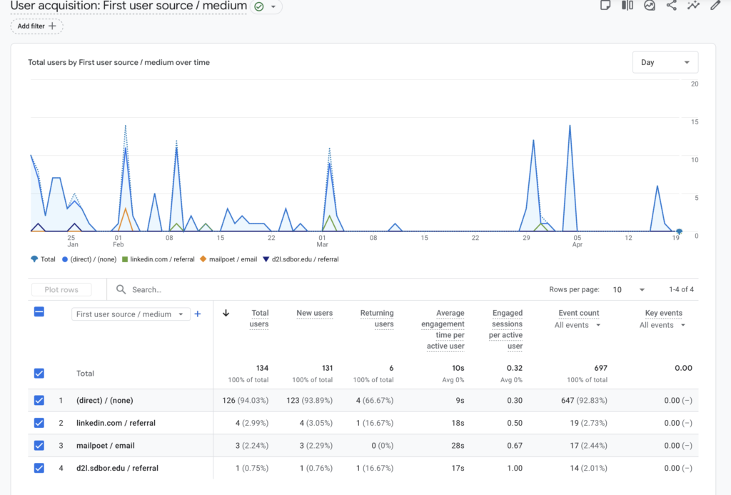
User acquisition – First user source / medium
The “First user source / medium” report was used because it shows where users originally came from when they first visited the website. This is useful in digital marketing because it helps track which channels are introducing people to the site. Instead of only showing where traffic came from in a single session, this dimension helps identify the original acquisition source, which makes it easier to evaluate the effectiveness of marketing efforts such as email, LinkedIn, school-related referrals, and direct traffic.
I used Average engagement time, New users, and Engagement because each one gives a different perspective on acquisition performance. Average engagement time helps measure how long users stay on the site after arriving from a source. This is important because longer time usually suggests higher interest in the content. New users is important because it shows which source is bringing in first-time visitors. Engagement-related metrics help show whether users are meaningfully interacting with the site after they arrive.
Describe what prompts you use for each metric above.
For this section, I used prompts that asked ChatGPT to explain the meaning of each GA4 result after I sorted the metrics in descending order. For example, I used prompts such as:
- “When I sorted the average engagement time in descending order in the First user source/medium classification, the following result came out. Please explain…”
- “When I sorted the average new users in descending order in the First user source/medium classification, the following result came out. Please explain…”
- “When I sorted the average engaged sessions per active user in descending order in the First user source/medium classification, the following result came out. Please explain…”
These prompts helped turn raw data into understandable marketing insights.
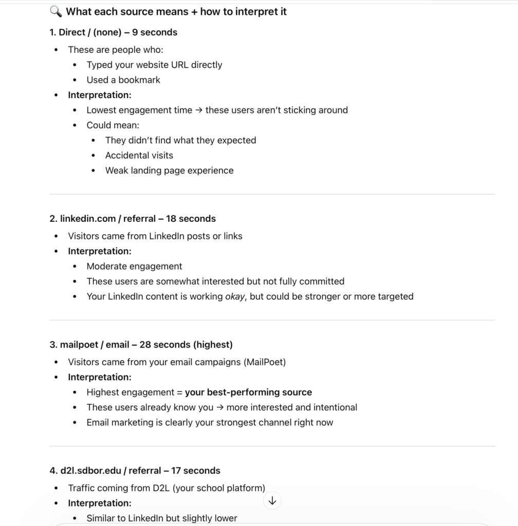
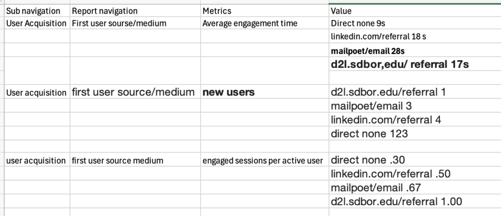
The user acquisition data showed meaningful differences between traffic sources. For average engagement time, mailpoet/email performed the best at 28 seconds, followed by linkedin.com/referral at 18 seconds, d2l.sdbor.edu/referral at 17 seconds, and direct/(none) at 9 seconds. This suggests that email traffic brought the most engaged users, while direct traffic was the least engaged.
For new users, direct/(none) produced by far the highest result with 123 new users, followed by linkedin.com/referralwith 4, mailpoet/email with 3, and d2l.sdbor.edu/referral with 1. This indicates that direct traffic was the strongest source for attracting first-time visitors, although direct traffic may also include untracked or unattributed visits.
For engaged sessions per active user, d2l.sdbor.edu/referral had the highest value at 1.00, followed by mailpoet/emailat 0.67, linkedin.com/referral at 0.50, and direct/(none) at 0.30. This suggests that D2L and email users were more likely to have meaningful sessions, while direct users were less interactive.
Overall, the user acquisition data shows that direct traffic brought the highest number of new users, but email and D2L produced stronger engagement quality. This suggests that quantity and quality of traffic are not always the same, and more intentional channels may bring fewer but more valuable visitors.
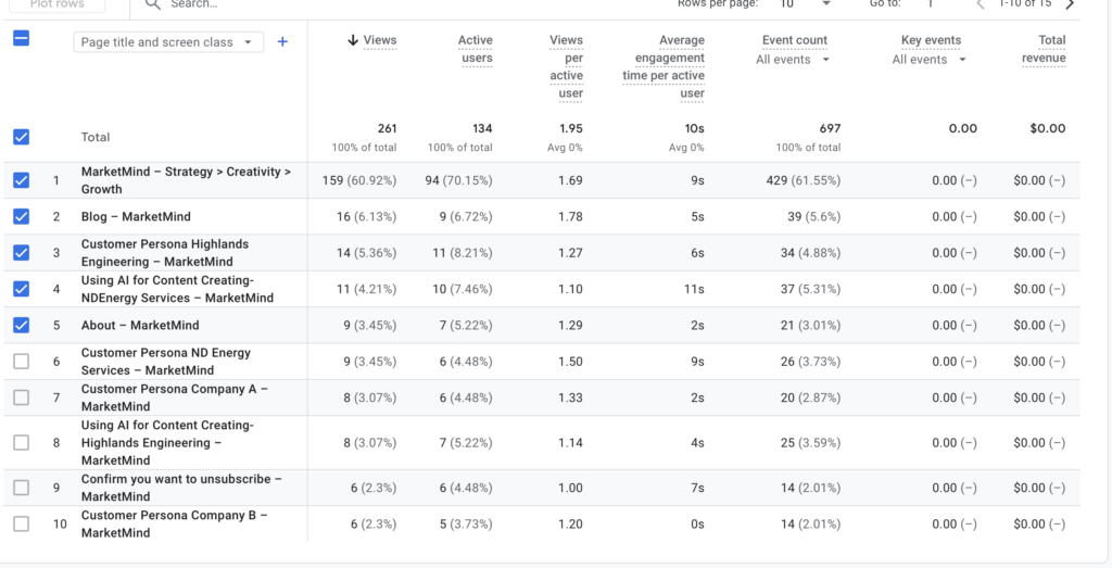
Engagement – Page title and screens
The “Page title and screens” report was used because it shows how users interact with specific pages on the website. This is useful because it helps identify which pages attract the most attention, which pages keep visitors engaged, and which content may need improvement. Looking at page-level data is important in digital marketing because content performance often determines whether users continue exploring a site or leave quickly.
I used Average engagement time, views, and Users because these metrics each show a different part of page performance. Average engagement time shows how long users stay on a page, which can help identify the most interesting or useful content. Views show how many times a page was visited, which reflects overall traffic and popularity. Users show how many individual people interacted with the page, which helps distinguish between repeated views and actual audience reach.
Describe what prompts you use for each metric above.
For this section, I used prompts that asked ChatGPT to explain the results after sorting page-level metrics in descending order. Examples of prompts include:
- “When I sorted the average engagement time in descending order in the engagement classification, the following result came out. Please explain…”
- “When I sorted the views in descending order in the engagement classification, the following result came out. Please explain…”
- “When I sorted the active users in descending order in the engagement classification, the following result came out. Please explain…”
These prompts helped me interpret which pages were strongest in terms of traffic and engagement.
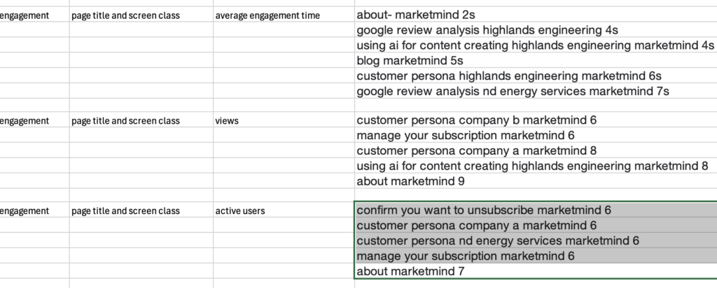
For average engagement time, the page google review analysis nd energy services marketmind performed the best at 7 seconds, followed by customer persona highlands engineering marketmind at 6 seconds, blog marketmind at 5 seconds, google review analysis highlands engineering at 4 seconds, using ai for content creating highlands engineering marketmind at 4 seconds, and about-marketmind at 2 seconds. This suggests that practical, analysis-based pages held attention better than general informational pages.
For views, about marketmind received the highest total with 9 views. It was followed by customer persona company a marketmind and using ai for content creating highlands engineering marketmind, each with 8 views. Customer persona company b marketmind and manage your subscription marketmind each had 6 views. This suggests that the About page served as a common entry or reference page, while the persona and AI-related pages also attracted solid interest.
For active users, about marketmind again ranked highest with 7 active users. The pages confirm you want to unsubscribe marketmind, customer persona company a marketmind, customer persona nd energy services marketmind, and manage your subscription marketmind each had 6 active users. This indicates that the About page had the widest audience reach, while persona pages also performed consistently well. The subscription pages had activity as well, but that engagement appears to be functional rather than content-driven.
Overall, the page-level analysis shows that users were most interested in analytical and persona-based content, while the About page received the most traffic and active users. This suggests that informative marketing content is valuable, but general site pages may still attract high visibility because they help introduce the brand or website.
User attribute – Demographic details
The “Country and City” report was used because it helps show where users are located and whether visitors from certain places are more engaged than others. Demographic information is important in digital marketing because it can help identify which geographic audiences are responding best to content. This can support decisions related to targeting, messaging, and future promotional strategies.
I used Users, Engagement rate, Average engagement time, and Engaged session per user because these metrics together help evaluate both the size and the quality of the audience by location. Users shows how many visitors came from each city. Engagement rate shows the percentage of visitors who had meaningful interaction with the site. Average engagement time shows how long those users stayed active, and engaged sessions per user shows how often users from each city had meaningful sessions.
Describe what prompts you use for each metric above.
For the demographic section, I used prompts that asked ChatGPT to explain the sorted city results for each metric. Examples include:
- “When I sorted Active users in descending order in the Country and city classification, the following result came out. Please explain…”
- “When I sorted Engagement rate in descending order in the Country and city classification, the following result came out. Please explain…”
- “When I sorted Average engagement time per active user in descending order in the Country and city classification, the following result came out. Please explain…”
- “When I sorted Engaged sessions per active user in descending order in the Country and city classification, the following result came out. Please explain…”
These prompts helped convert the city-level data into clear geographic insights.
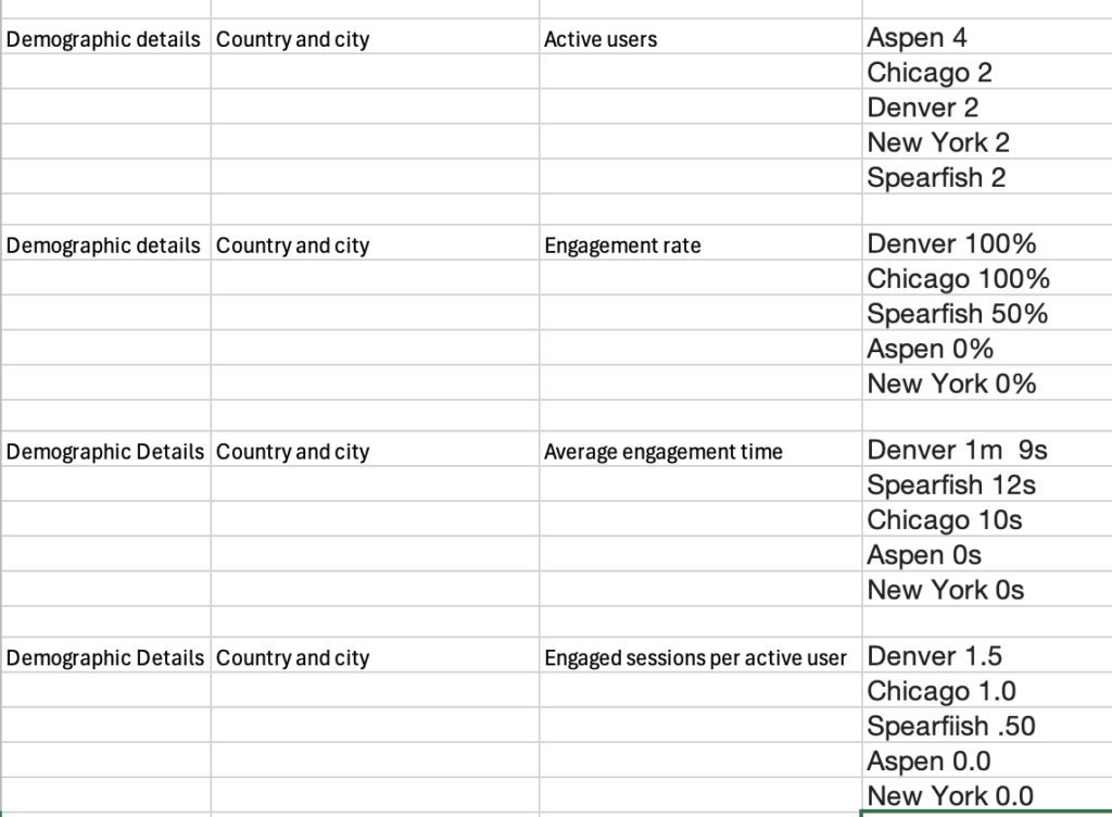
For Users, Aspen had the highest total with 4 active users, while Chicago, Denver, New York, and Spearfish each had 2 active users. This means Aspen generated the highest amount of traffic among the selected cities.
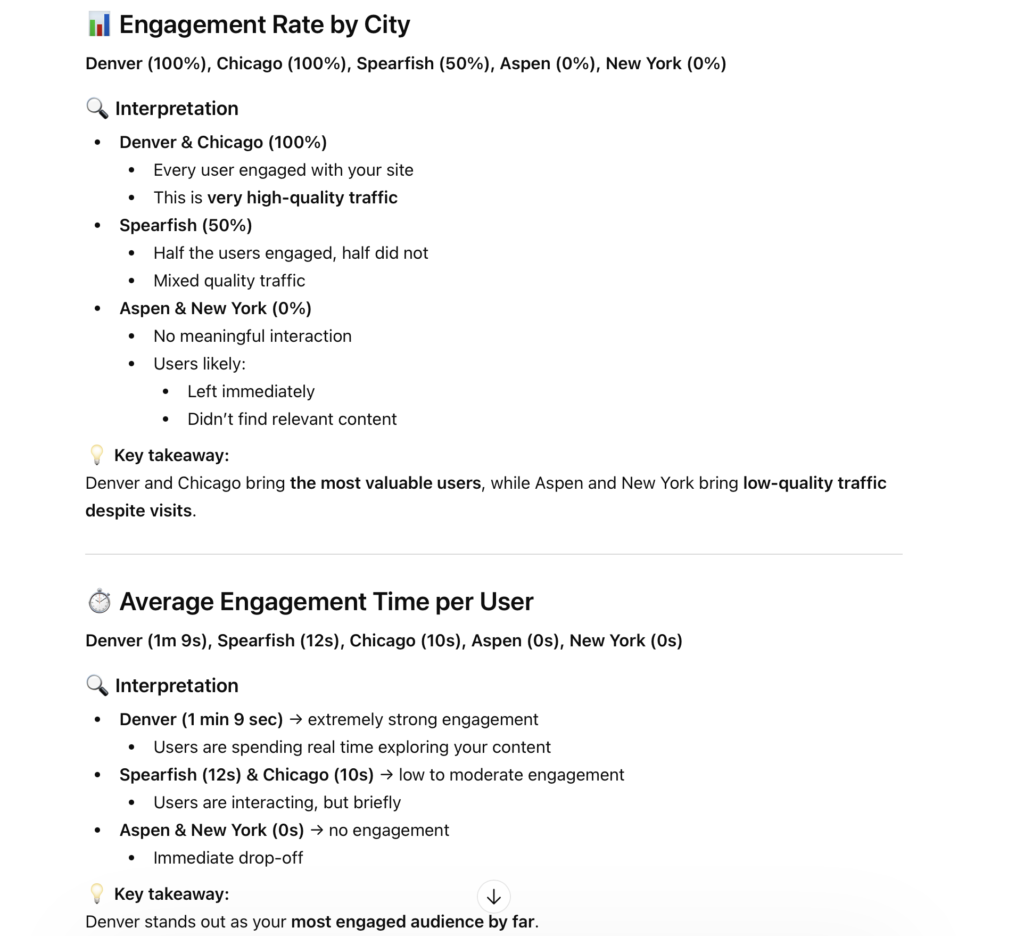
For Engagement rate, Denver and Chicago both recorded 100%, Spearfish had 50%, and Aspen and New York both had 0%. This shows that all users from Denver and Chicago engaged with the site, while none of the users from Aspen and New York had meaningful interaction.
For Average engagement time per active user, Denver ranked highest at 1 minute 9 seconds, followed by Spearfish at 12 seconds, Chicago at 10 seconds, while Aspen and New York both had 0 seconds. This suggests that Denver users spent significantly more time on the site than users from the other cities.
For Engaged sessions per active user, Denver again ranked highest with 1.5, followed by Chicago at 1.0, Spearfish at 0.50, and Aspen and New York at 0.0. This shows that Denver users had the strongest repeat or meaningful session behavior.
Overall, the demographic data shows that Aspen had the most users, but not the strongest quality of traffic. Denver stood out as the highest-quality audience, with the best engagement rate, longest average engagement time, and highest engaged sessions per user. Chicago also performed well, while Aspen and New York showed little to no meaningful engagement. This suggests that user quality matters more than traffic volume alone.
Conclusion
This web analysis using GA4 helped reveal important insights about user acquisition, page performance, and demographic engagement. The results showed that different traffic sources play different roles. Direct traffic brought the largest number of new users, but email and D2L traffic produced stronger engagement quality. This suggests that some channels are more effective for attracting visitors, while others are more effective for bringing in intentional and engaged users.
The page-level analysis also showed that analytical and persona-based content performed well in terms of engagement, while the About page attracted the highest number of views and active users. This suggests that users are interested in both learning about the brand and exploring useful, practical marketing content. Finally, the city-level demographic results showed that Denver produced the strongest engagement overall, even though Aspen had the most users. This highlights the importance of focusing not only on traffic volume, but also on the quality of that traffic.
Overall, this process demonstrates how GA4 data and AI prompts can work together to produce useful marketing insights. By combining analytics with well-structured prompts, it becomes easier to interpret website performance and identify actionable areas for improvement in digital marketing strategy.